StencilGirl Talk: Mary Beth Shaw's VLOG: March 2022
-
StencilGirl Talk: Mary Beth Shaw's VLOG: March 2022: Join Mary Beth in
Amsterdam and Paris! Click here for more information and registration!

VISIT ME AT PINTEREST!

VINTAGE SCRIPT
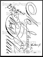
9" x 12" stencil
CATS

6"X6" stencil
SILHOUETTE OF A WILDFLOWER BOUQUET

6" x 6" stencil
BUDDING BRANCHES STENCIL

6" x 6" stencil
BRANCHING BLOSSOMS SILHOUETTE
9" x 12" stencil
NOSEGAY STENCIL
9" x 12" stencil
BUDS STENCIL
9" x 12" stencil
FACETS

9" x 12" stencil
PRESSED LEAVES

6" x 6" stencil
QUEEN ANNE'S LACE
9" x 12" stencil
MIKKI'S FLOWERS MASK

6" x 6" mask
MIKKI'S FLOWERS STENCIL

6" x 6" stencil
TANGLED PODS

9" x 12" stencil
SMALL TANGLED PODS

6" x 6" stencil
DANGLED PODS

9" x 12" stencil
SMALL DANGLED PODS

6" x 6" stencil
THISTLE

9" x 12" stencil
SMALL THISTLES

6" x 6" stencil
NOSEGAY STENCIL
9" x 12" stencil
SWATTON FLOWERS VERSION 1
6" x 6" stencil
SWATTON FLOWERS VERSION 2

6" x 6" stencil
MIMOSA 9

9"X12" stencil
MIMOSA 6

6"X6" stencil
BAMBOO WALL

6"X6" stencil
GINKGO

6"X6" stencil
FERNS

6"X6" stencil
FERN FRONDS SILHOUETTE MINI

4" x 4" stencil
IVY 9

9"X12" Stencil
IVY 6

6"X6" stencil
IVY FRAME 6
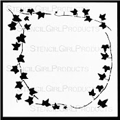
6"X6" Stencil
IVY FRAME 9
9" x 12" stencil
QUILTED FLOWER GARDEN

6"X6" stencil
BONSAI TREE

6"X6" stencil
SWAYING GRASSES

6" x 6" stencil
MARBLES 9

9" x 12" stencil
MARBLES 6

6"X6" stencil
TWINSHIP STENCIL

9" x 12" stencil
STEAMPUNK STENCIL

9" x 12" stencil
My Blog List
-
-
A Day of Play - I decided I needed to drag out all my mixed media supplies, starting with a bag of vintage ephemera to design some fun journal pages. I have been so foc...

-
ART made with SILHOUETTE OF A WILDFLOWER BOUQUET

a 6"x 6" stencil
Art Sample Made with KALEID 6"X6" stencil

using Gel & Rubbing Chalk Technique
Art made withTWO VASES 9"X12" stencil

Note: White vase was made with a homemade stencil.
Art made with GINKGO 6"X6" stencil

Gel & Sand Technique
Art made with TWO VASES 9"X12" stencil

Gelli Plate print
Art made with GINKGO 6"X6" stencil

See Feb. 12, 2013, post for technique details.
GARDEN MONTAGE

9" x 12" stencil/mask
GARDEN AT NEMOURS MASK

6" x 6"
LOOKING UP THROUGH TREES

9" x 12" mask
ATC MIXUP SWATTON #1

9 stencils & 3 masks
ATC MIXUP swatton #2

9 stencils & 2 masks
WINTER BERRIES MASK
9" x 12"
WINTER BERRIES STENCIL

9" x 12"
LONGWOOD FLORALS MASK

9" x 12"
LONGWOOD FLORALS STENCIL
9" x 12"
CLUSTERED LEAVES
9" x 12" stencil
LOOPY LADDERS

9" x 12" stencil
IT'S A JUNGLE OUT THERE
9" x 12" stencil
FANTASIA
9" x 12" stencil
SASSY SPRAY

6" x 6" stencil
SKI LIFT WORKS

6" x 6" stencil
PRAYER FLAGS
9"x12" stencil
PAVILION SHADOWS

6" x 6" stencil
ORNAMENTAL IRON CURLS

6" x 6" stencil
BUDDING BRANCHES

6" x 6" stencil
R & E m268

4"x 4" stencil
M&Y m267

4"x4" stencil
WEBBED MEDALLION

6" x 6" stencil
BLOOMING WHERE PLANTED
9" x 12" stencil
PENGUIN family

6" x 6" stencil
PAIR O' PARROTS

6" x 6" stencil
DANCE OF THE COURTING CRANES

6" x 6" stencil
PALM FRONDS SILHOUETTE MINI

4"X4" stencil
PALM FRONDS SILHOUETTE SMALL

6"X6" stencil
SPRIGS (a.k.a. HIDDEN ANGEL)

6" x 6" stencil
TIGER LILY STENCIL

6" x 6" stencil
BOXED VINES

9"X12" stencil
TWO FANS

9" x 12" stencil
TWO VASES

9" x 12" stencil
KALEID

6"X6" stencil
WROUGHT IRON GATE

9"X12" stencil
OSPREY WINGS

6"X6" stencil
HERON

6"X6" stencil
FEATHERS 9

9" X 12" stencil
FEATHERS 6

6"X6" stencil
SEAWEED

6"X6" stencil
VASES

9"X12" stencil
SWATTON BORDERS # 1

9"X12" stencil
SWATTON BORDERS # 2

9"X12" stencil
BORDERS #3

9"X12" stencil
SWATTON GRID STENCIL

6"X6" stencil
HOT AIR BALLOON AND MASK

a 6" x 6" set and a 4" x 4" set
LINKS

6"X6" stencil
TRIVET A

6" x 6" stencil
TRIVET A 9

9" x 12" stencil
TRIVET B

6X6" stencil
TRIVET C

6"X6" stencil
CROP CIRCLES

3-piece stencil set of June, 2015, available only to StencilClub Members...join via StencilGirlTalk; click this image to go there.